About Pertussis


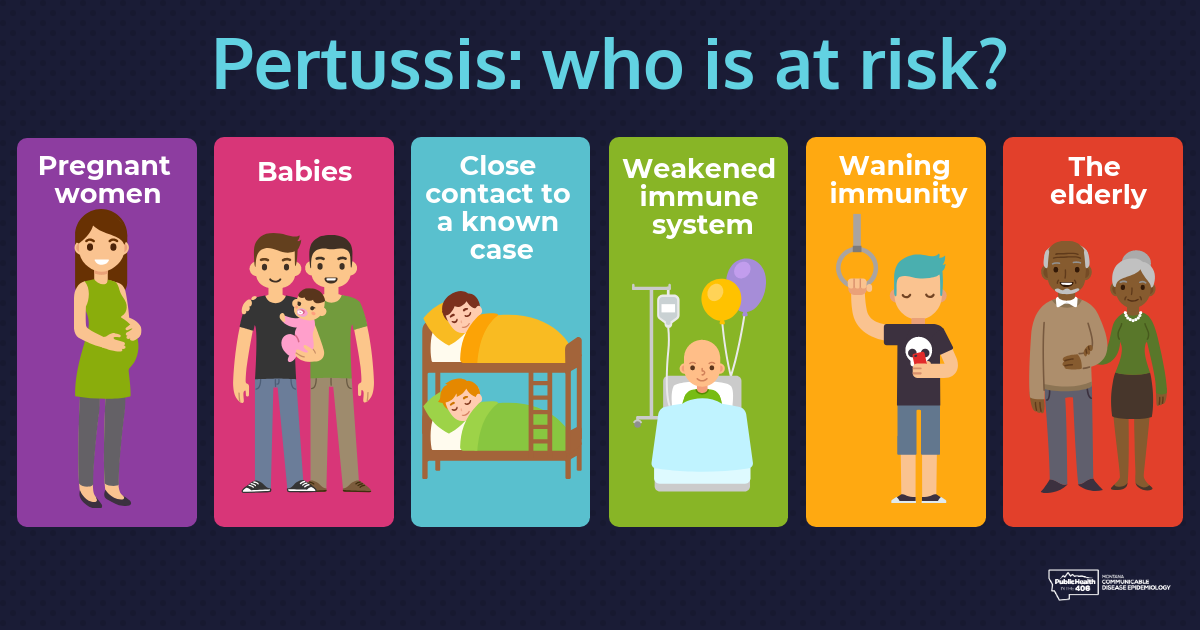
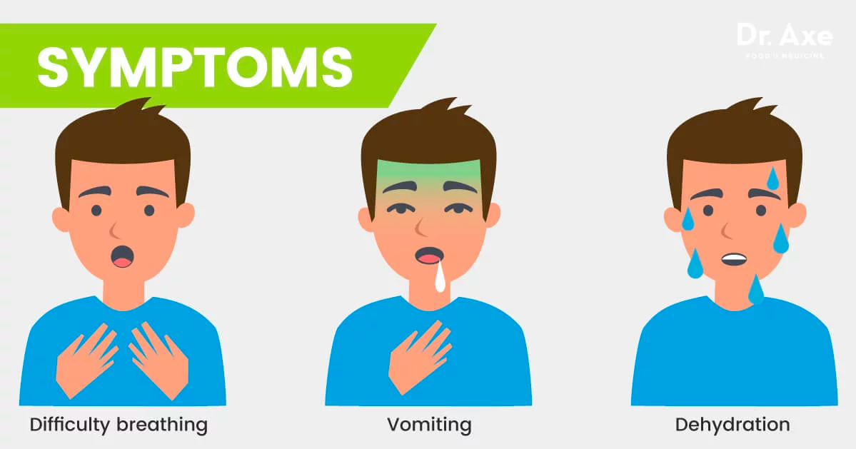
Pertussis, historically known as whooping cough, is a very serious respiratory infection caused by the pertussis bacteria. It can cause violent coughing fits. Whooping cough is most harmful for young babies and can be deadly.

Information on whooping cough:

  • Mayo Clinic: Information on Whooping Cough.

    "Whooping cough is caused by a type of bacteria called Bordetella Pertussis. When an infected person coughs or sneezes, tiny germ-laden droplets are sprayed into the air and breathed into the lungs of anyone who happens to be nearby."

  • Centers for Disease Control & Prevention: Pertussis (Whooping Cough)

    "Pertussis is known for uncontrollable, violent coughing which often makes it hard to breathe. After cough fits, someone with pertussis often needs to take deep breaths, which result in a “whooping” sound. Pertussis can affect people of all ages, but can be very serious, even deadly, for babies less than a year old."

Pertussis Symptoms

"The best way to protect against pertussis is by getting vaccinated."

-Centers for Disease Control

California County Pertussis Outbreak Information


Figure 1 - Plotly box charts showing county pertussis cases per 10,000 residents per year

Pertussis outbreaks occur every 3-5 years, as can clearly be seen above. There is a huge spike in cases in both 2010 and 2014, with the hardest-hit counties seeing upwards of 14 cases per 10,000 residents in each of those years.


Figure 2 - Plotly box charts showing county kindergarten vaccination rates

Kindergarten vaccination rates by county vary immensely, as can be seen on the above box chart. Some counties' kindergarten vaccination rates are nearly 100%, while others fall below 80%.


Anti-Vaccination

Figure 3 - Tableau graph showing kindergarten immunization rates by county for counties with a population over 1 million

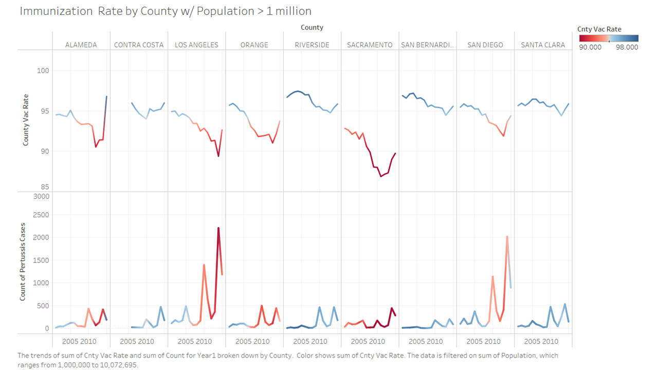
Immunization Rate by county for the nine most populated counties with color gradient centered at the 94% herd immunity rate for Pertussis, with at risk counties showing in red. Before diving into our machine learning model we did notice and inverse relationship between vaccination rate and reported Pertussis cases.


Figure 4 - Tableau map showing a variety of reported preventable disease cases over time

Map displaying the most common preventable diseases in California years 2001 to 2017. The size of the circles indicate the count of each type of infection. We observe a minor Pertussis outbreak in 2005, followed by major outbreaks in 2010 and 2014. Also, in 2011, Hepatitis A surpasses Invasive Meningococcal Disease (Meningitis) as the second most common preventable disease.

Data Collection & ETL


The California Health & Human Services (CHHS) Open Data Portal provided California pertussis incidents by county over time.


The Shots for Schools website was a huge help to this process as they took raw CHHS data and created csv files that included data on kindergarten vaccination rates by school, sorted by county. County data, then, became easy to extract and to merge with the other data sources.


Initially, only county population data over time was extracted from the US Census Bureau API. With the second iteration, however, an additional 75 columns of data was pulled for each California county for every year between 2010 and 2016. These were processed down to the following items:

  • County name
  • Total county population
  • Percent of population that was foreign born - Is it possible that people originally from foreign countries travel back to those countries more often and are thus more likely to spread pertussis?
  • Percent of population that moved from overseas in the past year - Do people moving from overseas (either returning or immigrating to the US) have a tendency to bring pertussis with them?
  • Percent of women ages 15-50 who had given birth in the previous year - This measure was considered because it is common for obstetricians to encourage pregnant women to get immunized against pertussis in their third trimester, some of whom encourage their families and friends to get immunized as well (cocooning).
  • Percent of population that was school aged (3- to 17-years-old) - It was worth considering if a large school-aged population made it more likely for a county to experience an outbreak because so many children were in close proximity to one another, or if it was less likely because children are required to be immunized to attend school.
  • Average household size - Does higher household size lead to an increased spread of disease, and hence a higher likelihood of an outbreak?
  • Percent of school-aged population not enrolled in public or private school - This measure is being used as a proxy for students ages 3-17 who are homeschooled.
  • Percent of the school-aged population that was below the poverty line - Does poverty play a role in the spread of pertussis, in particular at schools? It is possible that social programs make it more likely for low-income students to have access to immunizations. It's also possible that wealthy families are more likely to resist immunization or to have the ability to opt out from vaccinations, whether legal/ethical or not.
2010 DataFrame

Click here to view the full list of census variables used for analysis

Snippet of ETL process for US Census API data:

US Census ETL

Click to view full code for US Census ETL

Once the US Census data had been cleaned up and saved as a csv, it was combined with the California Kindergarten Vaccination Rate and pertussis incidents data from the CHHS Open Data Portal. The files all had county name as common columns, but needed to be cleaned up to match exact wording and case.


Jupyter Notebook

Additional data cleaning that was performed to allow all data to be joined:

Vaccination Data

  • Selected enrollment by school and number of students vaccinated for pertussis
  • Cleaned out rows where either enrollment or vaccination numbers were missing
  • Converted both enrollment and vaccination columns to numeric
  • Calculated sums for enrollment and vaccination on group by on county
  • Calculated new column of county-wide vaccination rate
  • Created a multi-level index of (year, county)
Population Data
  • Converted data from wide format to long format
  • Used first row as column names
  • Converted population column to numeric
  • Created multi-level index of (year, county)
Disease Incidence
  • Downloaded json file and converted to dataframe
  • Selected numbers of pertussis incidence by county
  • Created multi-level index of (year, county)
  • Merged with vaccination/population dataframe
  • Calculated incidence rate per 10,000 residents

Findings

Correlation Matrix

Figure 5 - Correlation matrix of the 9 features considered for analysis

View the full machine learning jupyter notebook here

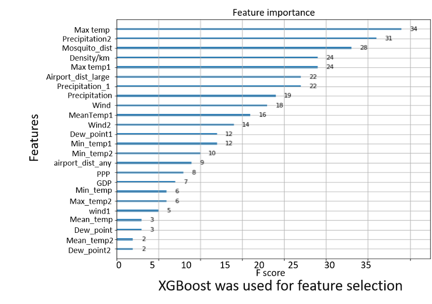
The correlation matrix was used to select which features to use for regression analysis. We selected the top 5 features based on their correlation to the outbreak percentage. A linear regression was run on each of these features to glean additional information.

Click on the features listed below to learn more.

Kindergarten Vaccination Rate


Linear Regression

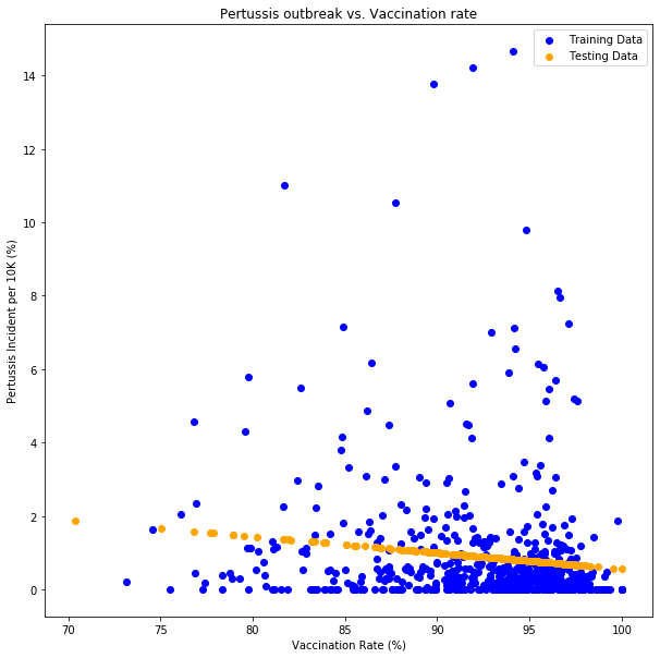
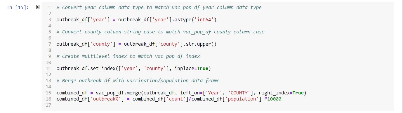
Figure 6 - Linear Regression plot of training data vs predicted

Predicted line has a shallow slope that shows a decreasing pertussis outbreak rate as the vaccination rate increases. Looking at the distribution of the training data plotted we can infer that the correlation between vaccination rate and pertussis cases is not very strong.


Logistical Regression

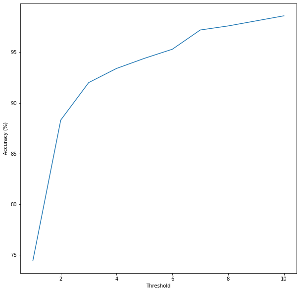
Figure 7 - Plot of incident threshold vs model accuracy

The plot shows that the higher the threshold set is to determine the greater the accuracy of the model. Based on the plot, we selected 10 as the threshold to run our logistic regression on.


Logistical Regression

Figure 8 - Logistic Regression plot of test data vs probability

Because the scatter plot of the linear regression seems to show a clusters of low incident and high incident, we decided to also do a logistic regression to predict outbreak vs. no outbreak. The plot of the regression data shows a higher probability of no outbreak as the vaccination rate increases, which is what we expected.

Years Since Last Outbreak


Foreign Born

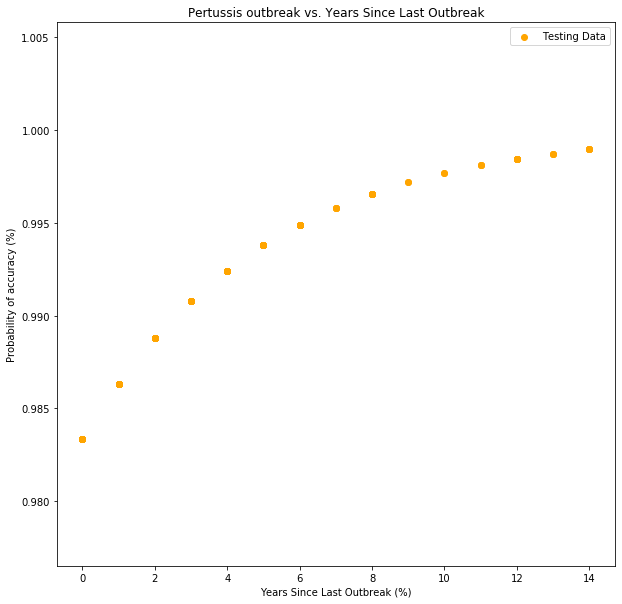
Figure 9 - Logistic regression plot of number of years since last outbreak to outbreak probability

Looking at the Tableau visualization (Figures 3 & 4 above) we could visually see that there is a cyclical nature to the outbreaks. We opted to further explore this pattern and found a correlation between the time in years since the last outbreak and future outbreaks.

Percent of Population that is Foreign Born


Foreign Born

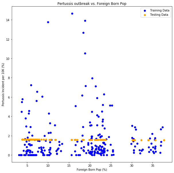
Figure 10 - Linear regression plot of population that is foreign born versus probability of accuracy

When we visualized the linear regression for foreign born population in each county against accuracy, we found minimal influence on the accuracy of the model, as can be seen by the near-zero slope of the regression line.


Foreign Born

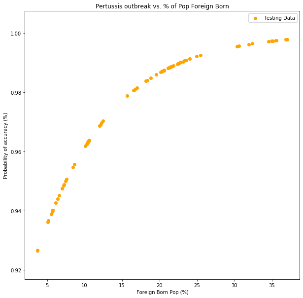
Figure 11 - Logistic regression plot of percent of population that is foreign born to outbreak probability

The probability does not vary widely over the entire range of the population percentages, which demonstrates the weak correlation in Figure 10.

Percent of Population that Moved from Overseas in the Last Year


Foreign Born

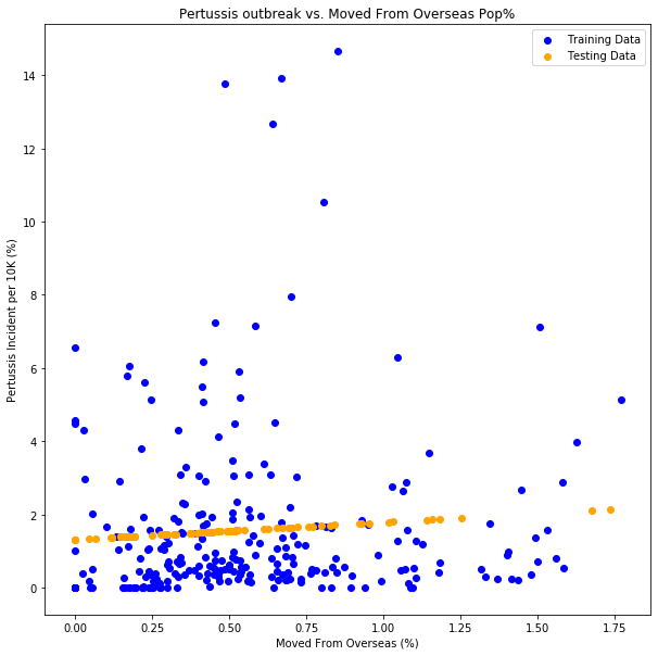
Figure 12 - Linear regression plot of population that moved from overseas in the past year versus probability of accuracy

There appears to be a slight correlation here.

Foreign Born

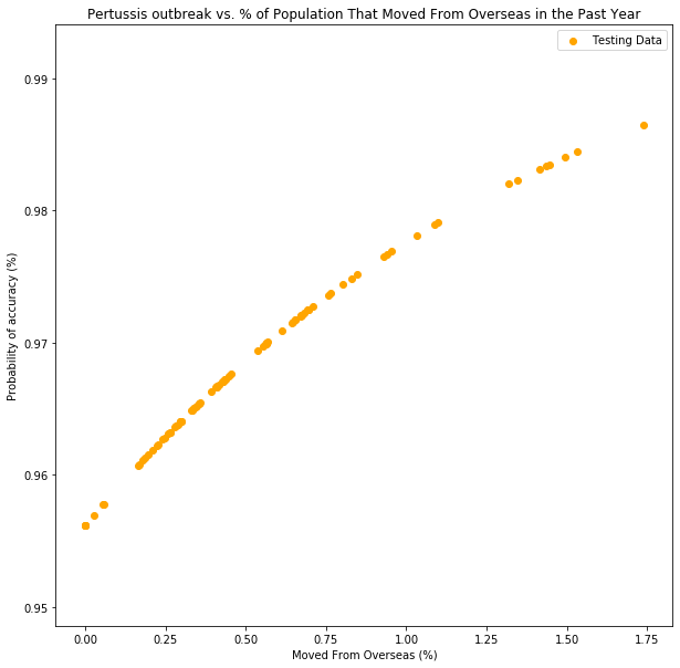
Figure 13 - Logistic regression plot of percent of population that moved from overseas in the past year to outbreak probability

We can see in the above graph that the percentage of the population in all counties that moved from overseas is less than 2%, which is likely why this feature has a weak correlation.

Percent of School-Aged Population Whose Family is Below the Poverty Line


Kindergarten Poverty Linear

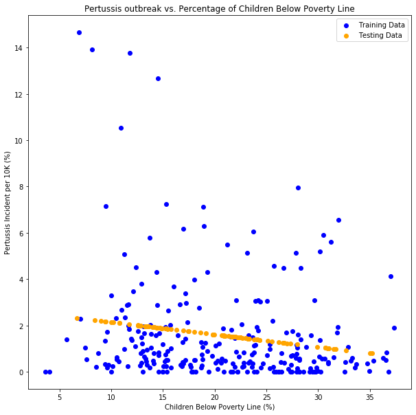
Figure 14 - Linear regression plot of percent of Kindergarten population whose family income is below the poverty line versus probability of accuracy

This feature is one of the stronger indicators that we found in our analysis, as can be seen in the chart above. The fact that it is a negative correlation is interesting, and provides some evidence of our speculations potentially being correct.

Kindergarten Poverty Logistic

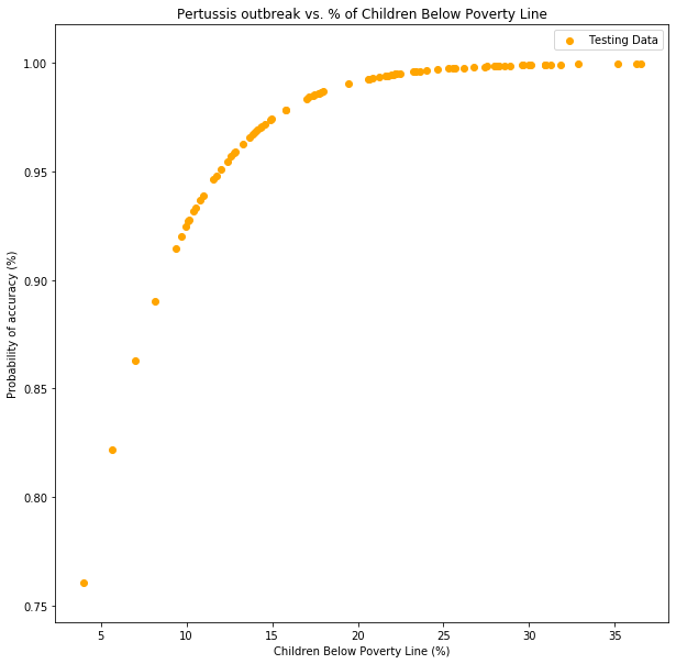
Figure 15 - Logistic regression plot of percent of Kindergarten population whose family income is below the poverty line to outbreak probability

The wider range of probabilities over the percentage of kids from low-poverty households strengthens the correlation.

Analysis of Project


Analysis

Factors that prevented a stronger model for predicting Pertussis outbreaks:

  • We used kindergarten vaccination rates as representing the overall vaccination rate for each county’s population. This does not account for those who relocated to counties after kindergarten age.
  • Immunity from either vaccination or having Pertussis is not life-long. This also weakens the use of kindergarten vaccination rate as representative of the general population.
  • Year to year changes in kindergarten vaccination rates only relates to a small portion of the population and does not reflect the same amount of change in the general population vaccination rate.
  • Access to additional datasets limited the model. Additional potential factors could include:
    • Population density of county or biggest city in county.
    • Proximity to international airport and number of flights to countries affected by pertussis.
    • Number of adults who work outside the home versus from the home.
    • Vaccination rates for general population.
As we added more features to our logistic regression, our data set lost a span of data point by a significant amount. We went from a 16 year span in our initial single feature linear regression to six years in our final model due to the limitation of data availability. While we did find other features with a notable correlation that would strengthen our ability to predict an outbreak, we lost nearly two thirds of our yearly data, weakening our model. Thus, an inherent problem in data science - the limitation of data.

Zika virus machine learning model as inspiration for future model

Zika Model